

Finding Your Way at NYU: Redesigning 13 Landing Pages for Streamlined Resouce Access
Challenge
On NYU’s large, dispersed campus, the website is essential for finding key information, yet the Student Affairs division’s landing pages made accessing resources confusing and time-consuming.
Approach
The wireframe template I created guided improvements in findability and accessibility, enhancing navigation, reducing clicks, and clarifying hierarchy across Student Affairs landing pages.
Solution
I designed a custom wireframe and applied it to all 13 Student Affairs landing pages, creating a more intuitive user experience and streamlining resource access.
Timeline
Executed over 12 months, this project followed six stages – research, content, mockups, collaboration, and implementation – with me as the sole creative.
Short on time? Jump to the key sections that matter most to you.
Process and Core Responsibilities
Research: Audited NYU’s website to identify each Student Affairs unit’s resources and services, compiling links for the redesign.
Content Writing: Developed copy in NYU’s brand voice, highlighting each unit’s offerings and applying insights from research and stakeholder meetings.
Mockup Design: Created a wireframe template in Figma and organized all content consistently within the template structure.
Visual Sourcing: Selected and edited images from the NYU Photo Bureau to support content and enhance the overall design.
Unit Collaboration: Shared mockups with unit leaders and communications managers via email and Zoom to collect feedback and verify content.
Implementation and Launch: Partnered with the CMS team to implement mockups in AEM, ensure accessibility, and publish finalized pages.
Additional Project Context
Collaborators
Supervisor: Served as the primary point of contact for the Student Affairs executive team and unit leaders.
Unit Leaders and Executive Team: Supplied content to fill research gaps and approved essential UX edits.
CMS Team: Provided editing access to approved pages and guidance on AEM implementation and accessibility standards.
Tools
AEM : Web implementation
Figma: Hi-fidelity mockups
Illustrator: Iconography design
Looker Studio: Data insights
Photoshop: Image editing
Notion: Research organization
Zoom: Stakeholder presentations
Target Audience
Current students: Seeking resources, services, and opportunities at NYU.
Prospective students: Interested in applying to NYU and exploring the student experience.
Parents and families: Helping their students explore college options.
Faculty and staff: Looking for information to help students who need support.
High-fidelity prototype on Figma
Research notes on Notion
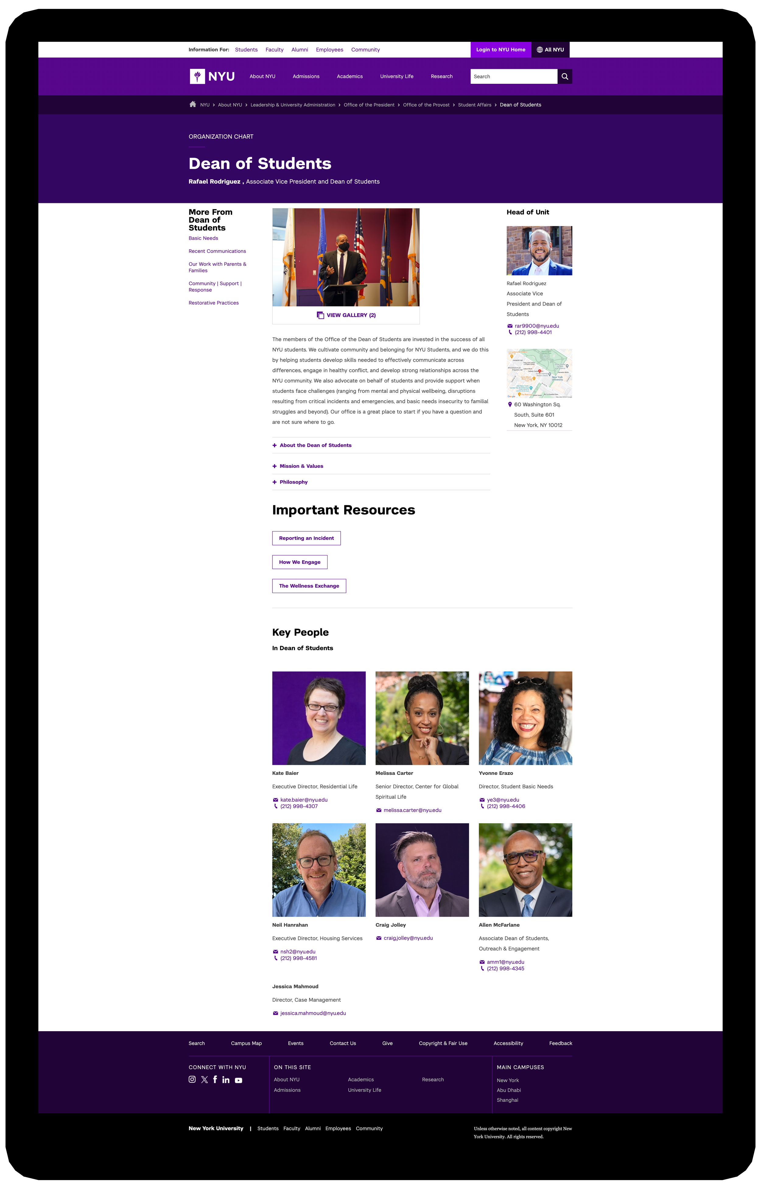
Before Redesign: ODOS Sample
Before the redesign, the original ODOS (Office of the Dean of Students) webpage did not reflect the depth of resources and services available or its central role in supporting student well-being and success at NYU.
The following pain points impacted each of the Student Affairs landing pages, including ODOS:
Structural-level
Sparse layout → page felt empty
Sidebar reliance → buried key info
No hierarchy → unclear content priority
Element-level
No CTA → no direction forward
Limited visuals → little breathing space
Missing links → navigation gaps
Review other Student Affairs landing pages before the redesign.
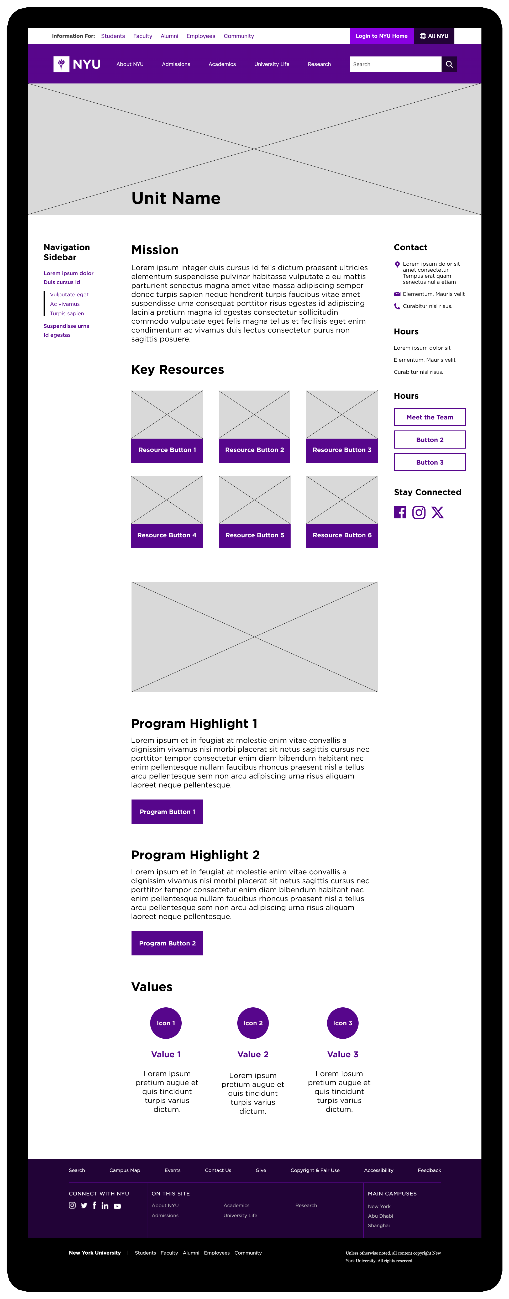
UX Solution: Wireframe Template
The wireframe template I created addressed the recurring pain points across the Student Affairs landing pages. Here’s an outline of the updated page structure:
Hero Image → Creates a visual entry point and immediately conveys each unit’s purpose.
Navigation Bar (Left Sidebar) → Organizes links for clear and direct navigation.
Information Bar (Right Sidebar) → Gives quick access to contact info, team links, and social media.
Mission Statement → Provides a concise overview of the unit’s objectives and services.
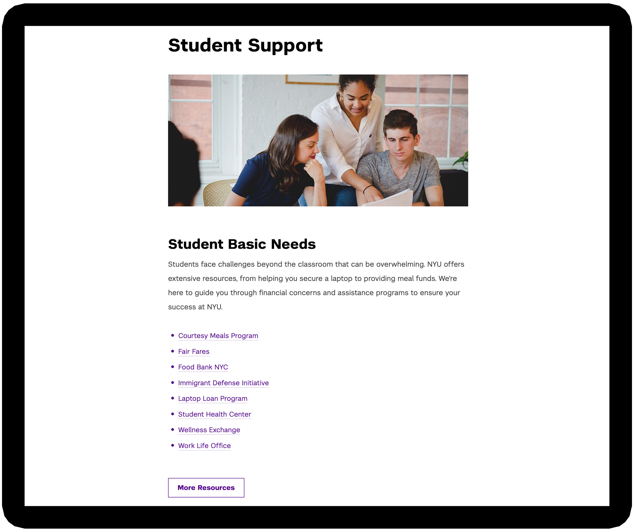
Key Resources Section → Highlights top resources through buttons linked to child pages.
Body Image → Breaks up dense text, reduces cognitive load, and supports visual hierarchy.
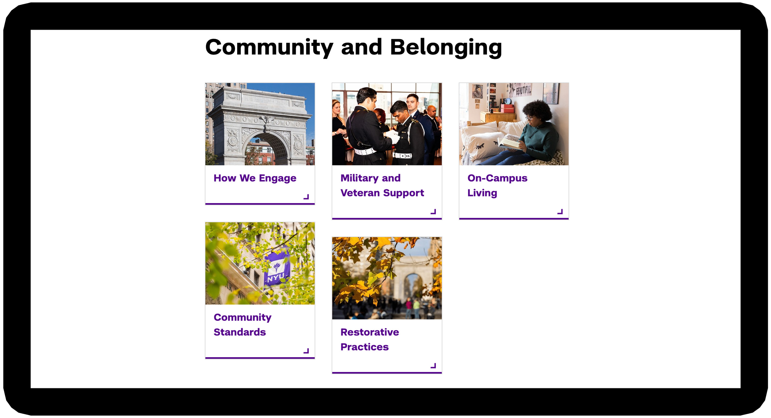
Highlights Section → Offers additional context for resources beyond buttons and images.
Values Module → Concludes the page while reinforcing layout consistency and reiterating the unit’s values.
Final Design Deliverable: ODOS Sample
Here are snapshots of the finalized ODOS landing page, tackling the three major recurring UX issues across Student Affairs sites. They reflect the key components of the wireframe guide I applied to all 13 landing pages.
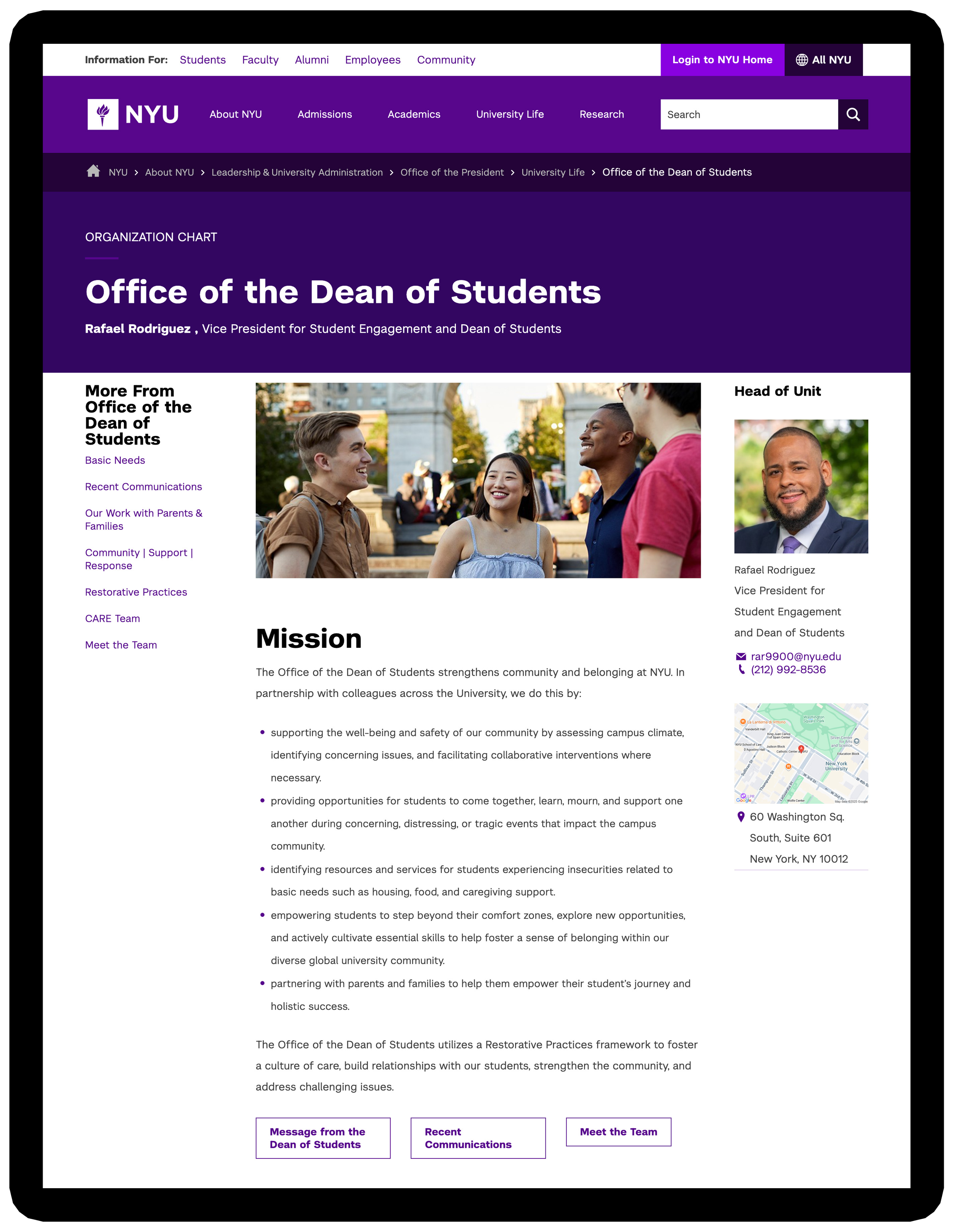
Problem 1: Inconsistent Layout Designs
Solution: Standardized navigation and content placement to create a consistent structure, making task flows predictable and resources easier to locate.
Problem 2: Absence of Visual and Textual Hierarchy
Solution: Implemented a structured visual and textual hierarchy, enhancing content clarity and scanability, with accessibility considerations for screen reader users.
Problem 3: Lengthy Click-Through Experiences
Solution: Highlighted key resources and added relevant links within the content section to reduce excessive clicks, providing direct paths to related pages.
Data Overview: ODOS
13 Student Affairs landing pages were launched gradually from October ‘24 to January ‘25. Below are the Looker Studio metrics for the Office of the Dean of Students webpage — captured before its redesign in March ‘24 and revisited in November ‘25, 13 months after its publication in October ‘24.
+260%
Increase in page views (2,758 in Mar ’24 → 9,937 in Nov ’25)
Page views more than tripled, indicating a growing audience reach and that more users are finding the site’s resources.
+114%
Increase in total users: 1,855 → 3,973 (Mar ’24 → Nov ’25)
The redesign successfully doubled its overall audience, demonstrating significant reach and visibility growth.
+74%
Increase in average time on page (39s in Mar ’24 → 68s in Nov ’25)
Visitors are spending more time on the page, indicating that the content is capturing and holding their attention, despite the slight drop in overall engagement.
-22%
Engagement rate (67% in Mar ’24 → 53% in Nov ’25)
Although increased traffic brought more casual visitors, there’s an opportunity to optimize calls-to-action and interactive features to convert attention into engagement.
+85%
Increase in new users of total visitors (576 in Mar ’24 → 1,066 in Nov ’25)
A growing share of visitors are first-time users, showing an increase in reach and audience growth.
Overall Interpretation
Increased traffic and page views
Higher share of returning users, showing stronger retention
Lower engagement rate but longer engagement time per visit
Deeper interaction suggesting clearer navigation and enhanced resource access
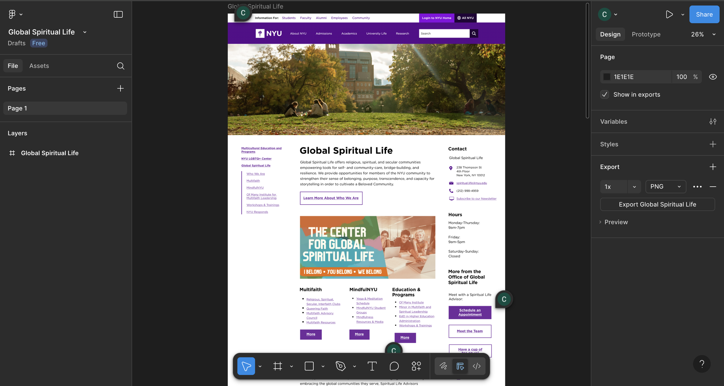
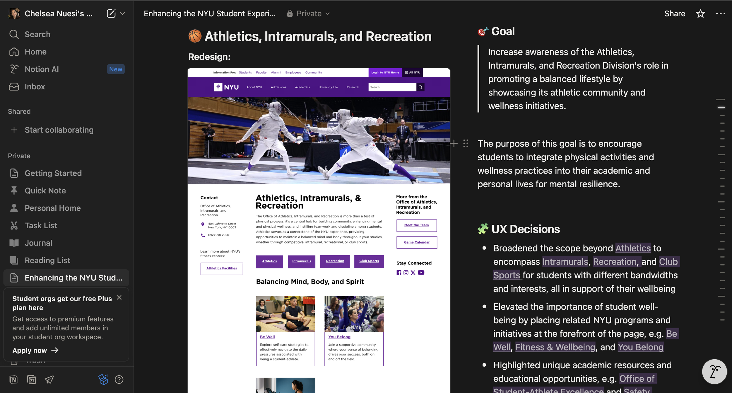
Mobile View: GSL Sample
Providing another reference for the redesigned Student Affairs pages, these snapshots showcase the finalized GSL (Global Spiritual Life) landing page on mobile. They highlight key features from the wireframe guide I developed and applied across all 13 unit pages.
Data Overview: GSL
From March 2024 (before the redesign) to November 2025 (10-11 months after the launch in January 2025), the GSL landing page saw significant growth:
Total users: 334 (🟢 +147%)
New users: 47 (🟢 +194%)
Page views: 415 (🟢 +127%)
Average engagement time: 19 sec (🔴 −29.6%)
Engagement rate: 80.79% (🟢 +7.5%)
Takeaway: The redesign drove a noticeable increase in users, page views, and new visitors. While average engagement time decreased, the improvement in engagement rate shows an opportunity to enhance content and user experience for deeper interaction.
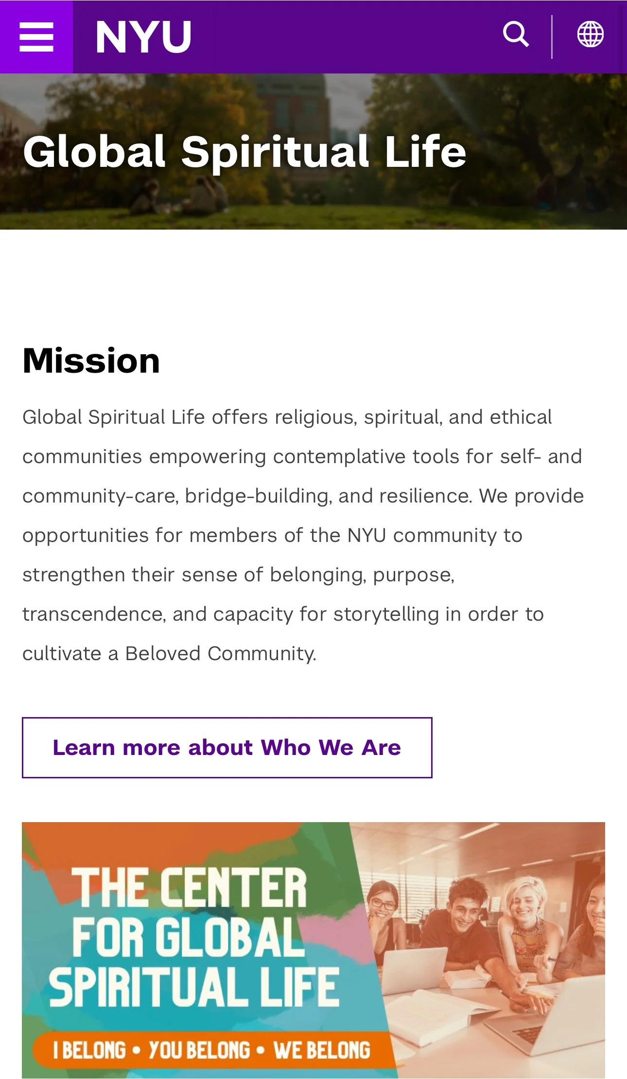
Mission Statement: Per stakeholder’s requirements, maintained the original mission statement and call-to-action button for users to learn more about GSL.
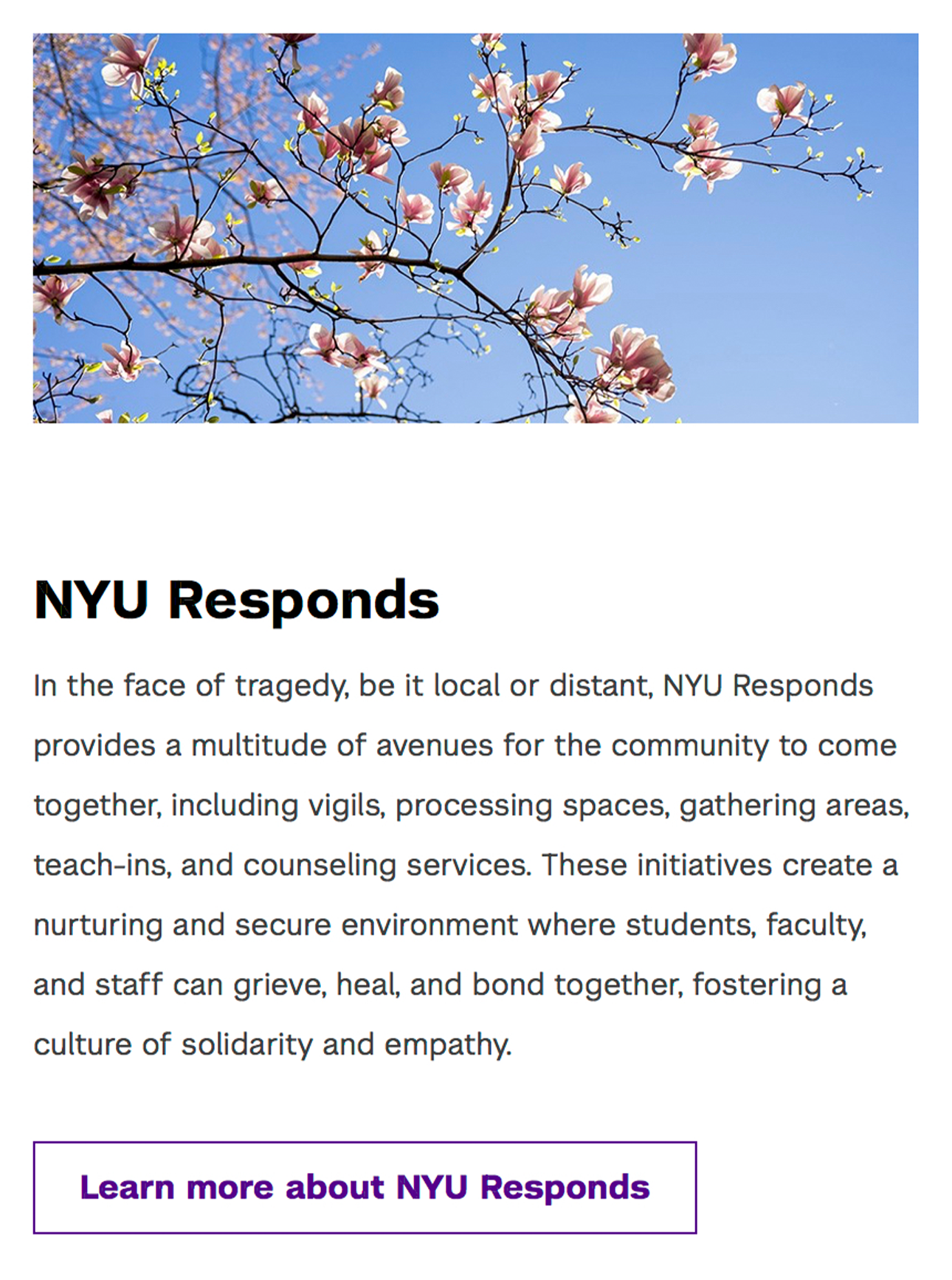
Body Image: Selected abstract, architectural, and nature-based visuals to represent sensitive or complex topics in a respectful, non-literal way. These choices support emotional safety while maintaining the page’s positive, neutral tone.
Body Copy: Expanded program descriptions that aren’t easily conveyed through short labels or visuals, giving users the context they need to understand each offering and explore further with confidence.

Key Resources: Organized the resources section using text-based hierarchy, allowing users to easily scan and access additional information through direct links to child pages.

Accessibility Practice: Per NYU’s accessibility requirements, included the file size on the button linking to a Google Doc so users can anticipate load times across devices, especially those on mobile data or slow WiFi.

Promo Buttons: Added image-based buttons to create clear pathways to child pages with additional resource details — in GSL’s case, guiding users to campus faith spaces.
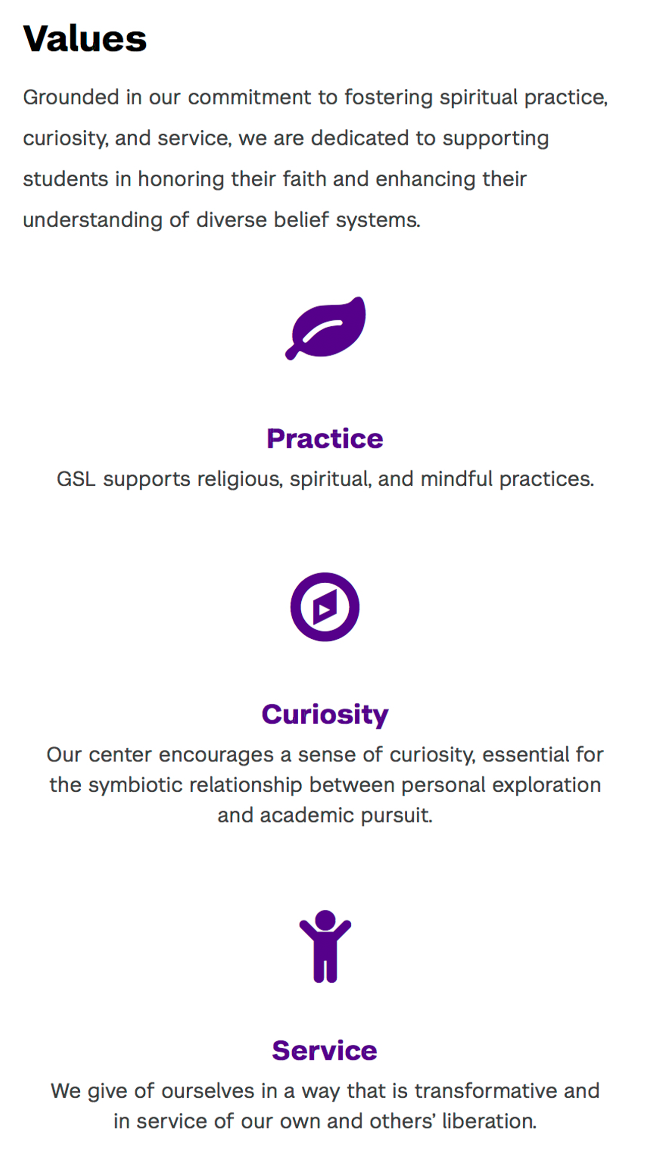
Values: Added the unit’s core values, which appear across all Student Affairs landing pages, to highlight the unit’s objectives and create consistency across pages.

Contact Info / Mobile View: NYU’s layout template shifts the navigation bar to the bottom on mobile, while keeping it on the right sidebar for desktops for quick access.
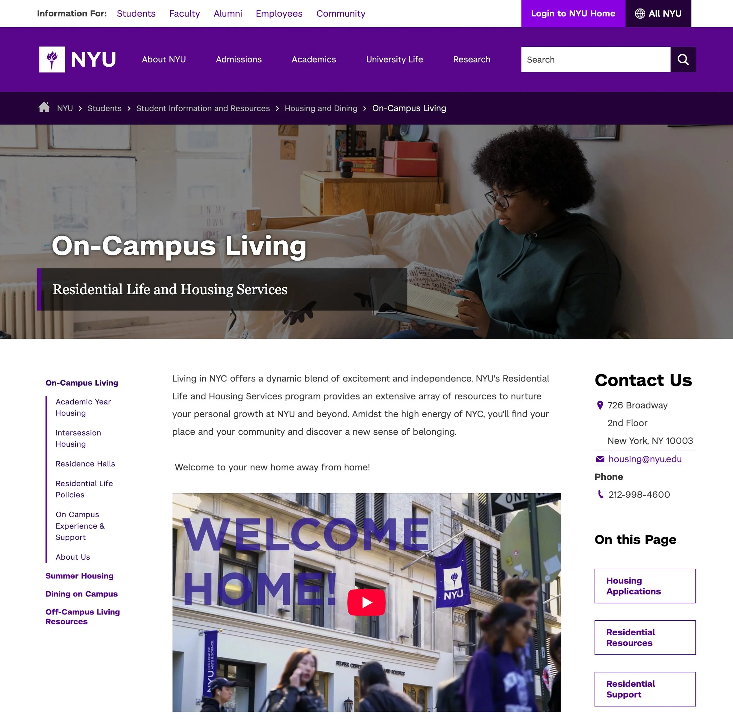
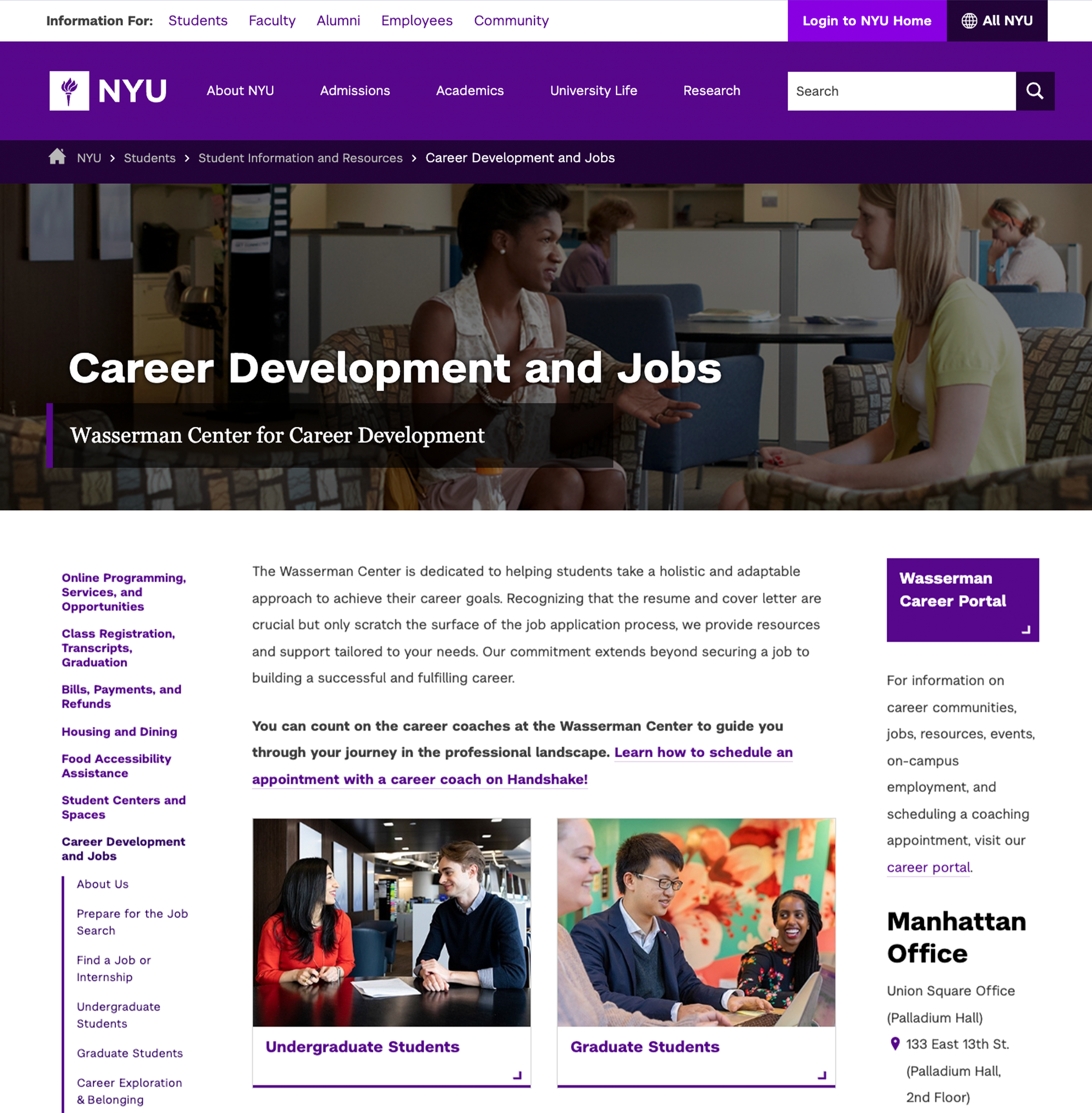
Additional Redesigned Pages
Wasserman Center for Career Development
Since the redesign launched in December 2024, the Wasserman Center webpage has shown steady growth. As of November 2025, it achieved:
Total users: 17,336 (🟢 +190.1%)
New users: 2,309 (🟢 +175.8%)
Page views: 23,997 (🟢 +199.9%)
Average engagement time: 00:00:19 (🔴 -9.5%)
Engagement rate: 81.09% (🟢 +0.25%)
Takeaway: The redesign drove significant growth in total users, page views, and new visitors. Engagement metrics decreased a bit, highlighting an opportunity to enhance content.
On-Campus Living
After the redesign launched in January 2025, the On-Campus Living landing page saw substantial growth through November 2025:
Total users: 80,397 (🟢 +1,414.9%)
New users: 14,215 (🟢 +1,734.2%)
Page views: 125,375 (🟢 +1,448.0%)
Average engagement time: 27 seconds (🟢 +1.3%)
Engagement rate: 87.11%% (🔴 −1.3%)
Timing influenced engagement: Peaks in April coincided with housing applications, with lower interaction outside that period.
Takeaway: The redesign dramatically increased users and page views, improving visibility and reach. Understanding contextual patterns can help sustain engagement beyond peak periods.
Project Reflections
Challenges
Solo Execution: I executed every phase of the project independently, from research and content writing to design and web implementation. While I received stakeholder feedback and accessibility support from the CMS team, additional collaboration could have expanded the redesign’s impact.
Template Limitations: Working within NYU’s website and page templates limited opportunities to modernize the outdated structure and explore new ideas, restricting how much the redesign could improve usability and align with current web standards.
Design Alignment: Stakeholder preferences often conflicted with UX best practices. Managing these conflicts required careful communication to maintain a consistent, functional design while securing buy-in throughout the project.
Project Takeaways
Hands-on Execution: Managing research, content writing, design, and implementation independently strengthened my ability to carry a project from start to finish while juggling multiple responsibilities. This experience honed my skills in prioritization and decision-making.
Problem-Solving within Constraints: Working within NYU’s webpage templates required resourcefulness and creativity. I learned to adapt ideas to existing structures while still improving design, usability, and accessibility.
Collaboration and Feedback: Even as the sole executor, gathering input from stakeholders underscored the value of external perspectives. Their feedback helped refine my designs and enhance outcomes for the target audience.