

Finally Here: Designing NYU Student Affairs’ New Year-in-Review
Challenge
For six years, NYU Student Affairs had no formal documentation of its impact on student success, limiting recognition among prospective students and families considering NYU, as well as donors supporting university initiatives.
Solution
I produced the first year-in-review in AY 2023–24 and was tapped again for AY 2024–25 to highlight the division’s achievements, unify contributions from seven offices, and clearly communicate impact to key university stakeholders through data and storytelling.
Timeline
The offices featured in the report were given three months to provide data, images, and writing. I then spent two months organizing this information and designing both a print-ready version and a digital version with accessibility features for publication.
Approach
Guided by content from the Student Affairs offices and the Student Flourishing Framework, the design prioritized brand alignment and data storytelling. As accessibility needs surfaced, full screenreader compatibility became a central driver of the final design.
Short on time? Jump to the key sections that that matter most to you.
Core Responsibilities
Content Collection: Coordinated with staff through email, organizing submissions in Google Drive for easy access.
Design: Created a cohesive booklet design using data, imagery, and text, with a focus on accessibility and engagement.
Document Accessibility: Implemented accessibility best practices to ensure essential content is accessible for screenreader users.
Distribution: Published the accessible report online for a division-wide e-blast and coordinated with vendors to print copies.
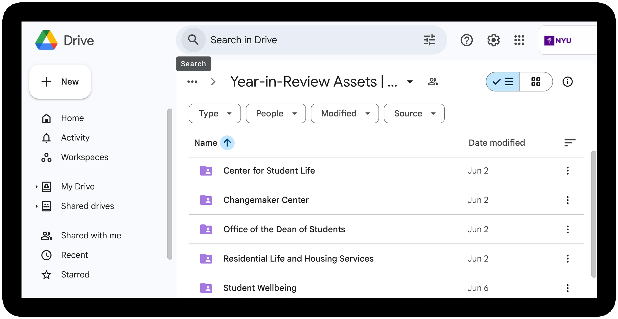
Content Collection
Executed the content collection process across all seven units, ensuring seamless collaboration and insightful contributions. Key actions included:
Organizing Google Drive content: structured folders for visual, text, and data-based submissions.
Directing content creation: crafted questions to guide writing, photo submissions, and data curation.
Managing deadlines and coordination: kept contributors on track for timely, high-quality submissions.
Sample Guidance Questions for Year-in-Review
Key Achievements: Provide 2-3 standout achievements from AY 2024-25.
By the Numbers: List 3-5 key data points that reflect your unit’s performance or impact.
Student Collaboration & Impact:
Choose one:
Student Collaborations: Highlight a project or partnership with a student or student organization.
Student Impact: Describe resources or services your unit provided that supported student growth and success.
Optional:
Additional Achievements/Insights: Describe accomplishments or details not covered above.
The Design Process

DNA-Inspired Poster Design
Developed the concept that flourishing is encoded in the DNA of NYU students and brought it to life in this poster. By leveraging NYU’s brand colors, the design reinforced the message and served as a visual cornerstone for marketing campaigns, shaping the year-in-review design and creating a cohesive narrative across all materials.

From Poster to Booklet
The ribbon on the Year-in-Review cover symbolizes the journey of student flourishing at NYU. Its twisting form echoes a DNA spiral, while the iridescent colors reflect the diversity of student perspectives and talents. Both elements visually link to the poster’s DNA strand, reinforcing identity and connection across materials.
Accessibility Design
With guidance from the Digital Accessibility team at NYU, I created an accessible PDF of the year-in-review on Adobe InDesign, in compliance with WCAG and ADA standards, for audiences with visual impairments. This stage of the design process ensured inclusive, accessible access to essential content.
The following elements were key to passing the accessibility test:
Layers: Organized design elements into structured layers to create a smoother workflow before applying tags and accessibility features.
Articles: Arranged essential text, data, and images in the proper reading order, marking decorative elements – such as icons and shapes – as artifacts for screenreaders to skip.
Paragraph Styles: Applied consistent heading and paragraph styles so screen readers could recognize hierarchy and allow clear navigation.
Color Contrast: Ensured strong contrast between text and background to maintain readability for users with low vision or color vision differences.
Alt Text: Wrote concise descriptions for essential images so readers with visual impairments could visualize the imagery in their minds with their screenreaders.

The Completed Booklet
Print and Distribution
Print Booklet
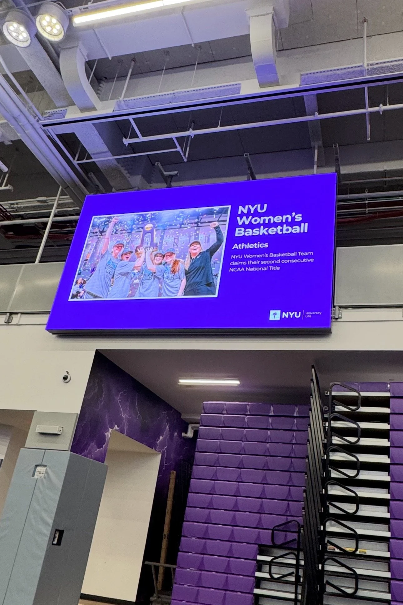
We printed physical copies of the year-in-review with the help of a third-party printer to share with 300 attendees at the annual fall convening. The event, held in the gym at the recently renovated John A. Paulson Center, featured screens displaying photos and highlights from the past academic year.
Staff browsed the booklet as leaders presented their unit’s accomplishments. Copies of the booklet and the “Flourishing: Inside NYU’s DNA” poster were available at the entrance for staff to take, display in their offices, and share with colleagues, prospective students, and families.
Digital Booklet
I created an accessible digital version of the booklet, optimized for screenreader compatibility, to provide an inclusive experience for all users. The accessible version of the year-in-review was shared with Student Affairs staff through “The Digest,” the division’s monthly e-blast. This digital format allowed staff to easily view, download, and share the publication across the University.
Project Reflections
Challenges
Limited Content: NYU Student Affairs does not have a dedicated photography team. Sourcing images for the annual report required avoiding repeat photos from the previous year, adding constraints to selecting visuals that met both aesthetic and production standards.
Accessibility Design: Accessibility requirements were introduced late in the design process, creating more pressure to meet the final deadline. If these requirements had been established earlier, the document could have been created for accessibility from the start, streamlining the entire implementation process.
Limited Accessibility Technology: To ensure screenreader compatibility, the online PDF could not be published in spreads. It had to be exported as single pages to prevent navigation errors for users relying on assistive technology, which affected the digital flipbook effect originally planned. This requirement reflects the current state of accessible technology rather than a project error, as support for digital spreads is still developing.
Key Takeaways
Full-Project Ownership: Led the design of a 40-page booklet from start to finish — managing content collection, visual design, accessibility, and printing — demonstrating the ability to oversee complex projects independently.
Adaptability: Navigated tight timelines, shifting stakeholder schedules, and evolving accessibility requirements, while adjusting workflows quickly to meet deadlines without compromising quality.
Collaboration and Communication: Coordinated with stakeholders, vendors, and internal teams, solving complex challenges through clear communication and problem-solving.
Resourcefulness: Compensated for low-quality submissions and maximized limited resources by curating images from existing libraries, maintaining visual consistency and storytelling impact.
Accessibility Expertise: Applied NYU’s accessibility standards in Adobe InDesign and Acrobat, producing a screen reader-friendly PDF and ensuring inclusive access for all audiences.
The Previous Year-in-Review
The 2023-24 Year-in-Review serves as an additional example of my skills and experience in storytelling and design strategy.